| Table of Contents | ||
|---|---|---|
|
This article covers basic accessibility guidelines for course development.
Introduction
There are both legal and moral obligations to creating content that is accessible to everyone.
The Canadian Charter of Rights and Freedoms states that
15. (1) Every individual is equal before and under the law and has the right to the equal protection and equal benefit of the law without discrimination and, in particular, without discrimination based on race, national or ethnic origin, colour, religion, sex, age or mental or physical disability.
We have a legal obligation to support those with physical disability, and this document will focus mainly on addressing the needs of those with visual and hearing impairment, both of which are very common. Colour vision deficiency affects 1 in 12 men and 1 in 200 women in the world and about 5% of the world's population have "disabling" hearing loss.
Content and instruction should be clear and concise
Clear and concise content will be beneficial to everyone, and can be especially beneficial to those using assistive technology.
- Content should be easy to understand and avoid unnecessarily technical language.
- Write in short, clear sentences and paragraphs.
- Avoid using unnecessarily complex words and phrases.
- Expand acronyms on first use.
- Ensure that instructions and information needed for a task are in one location only if possible.
Use headings and lists to convey meaning and structure
Headings provide a structural hierarchy to the document. Screen readers will usually announce headings and allow users to quickly navigate the structure of the document. Users can jump between headers or other elements such as paragraphs or list items. Use of introductory sentences in paragraphs is recommended, as this allows all users to quickly skim content when needed.
Visual readers identify headers by scanning pages for text of a larger size or a different style. Users relying on screen readers are not able to see these visual changes, so changing the style is not a sufficient cue. Headings and lists must be created using the heading and list buttons in the editor. A list that is created by manually entering dashes before each list item will not be recognized as a list by a screen reader.
The following is an example of how the headers on a website create structure for the information, allowing users to more easily navigate.
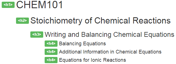
To add a heading in the Moodle text editor, set the heading level of the text by selecting the text and then choosing the appropriate heading level from the text editor menu.
In Moodle, on activity and resource pages, Moodle uses heading level 1 for the course title and level 2 for the page title, leaving levels 3 and above for course content. On the main course page, level 3 is used for section (unit/week) names, leaving levels 4 and above for course content.

To create a list, select the text, and then click either the bulleted list button or the numbered list buttons.

Ensure text is formatted correctly otherwise the results can be very frustrating for some users. Listen to the audio sample below of the results from a screen reader (JAWS 17) for this piece of content that was not formatted correctly.
View file name JAWS Example - Poorly Formatted Content.mp3 height 150
Make linked text descriptive
Linked text should be descriptive (i.e., do not use "click here"). Assistive technology will read out the linked text, but assistive technology will usually not read a link's title text; so the linked text is very important. For example, a screen reader will read out the previous link as "assistive technology will usually not read the link's title text", which is enough information for someone using a screen reader to understand the purpose of the link.
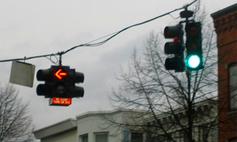
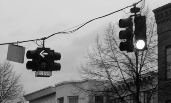
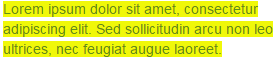
Convey information using more than just colour
Information should be presented so that people can understand it without relying on colour. This is more often an issue with charts, maps, and diagrams. What can we do: icons, shapes, or patterns can highlight–without colour–different categories of content.
For example, some users may not be able to see red or green which could have catastrophic consequences in this situation:
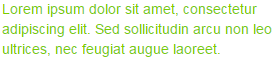
Ensure that colour combinations provide sufficient contrast
When text is viewed by someone having colour vision deficiency, the text and background can blend into each other making it difficult to read. Use black on white or check the contrast using this Colour Contrast Check tool. Here is an example of content that is not accessible.
Provide a text equivalent for non-text elements (image, video, audio)
Since users with visual impairments rely on technologies such as screen readers to assist them to interact with content, alternative text attached to non-text elements serves the same purpose and conveys the same essential information as the image, chart, graph, etc.. Transcripts allow the same content of video and audio to be available to users with hearing impairments.
Write meaningful text alternatives for images
For example, if an image shows a doctor taking a patient's blood pressure, the alternative text might be "doctor measuring patient's blood pressure". Additionally, alternative text should explain to the user what meaning the image is intended to convey, so the above alternative text may be further improved by explaining how the image is demonstrating correct placement of the blood pressure measuring cuff, if this is the intention of the image. Do not add alternative text to decorative images that are not intended to convey any meaning, as this will allow screen readers to ignore these images.
To add alternative text to an image in Moodle while adding the image in the text editor, enter the descriptive text into the "Describe this image..." field. If the image is decorative do not add a description and instead select This image is decorative only.

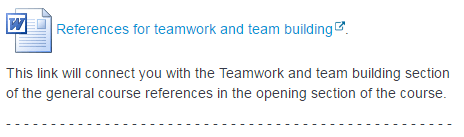
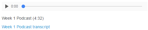
Include transcripts for video and audio
Alternative text for audio or video will depend on the technology used, but may be as simple as a link to a transcript. Here is an example of how a podcast might look with a link to a transcript below it:
YouTube will automatically generate captioning for videos. You can review and correct the automatically generated captioning with the following steps:
- Navigate to your video in YouTube
- Click the CC button immediately underneath the video for closed captioning
- Select the language when prompted
- On the right side, click on the language that you would like to edit
- Click the Edit button in the top right
- Edit the text on the left, and when you're done click the Publish edits button in the top right
Additional Tips
For tips on other ways to ensure an inclusive learning environment for students with low vision, visit this blog post on Tips for Supporting a Student who is Blind or Partially Sighted.
| Insert excerpt | ||||||
|---|---|---|---|---|---|---|
|
Related Articles
| Filter by label (Content by label) | ||||||||
|---|---|---|---|---|---|---|---|---|
|